

Value
The Value component accepts a query and displays a formatted value inline in text.
By default, Value will display the value from the first row of the first column of the referenced data.
<Value data={query_name} /> <!-- First row from the first column -->Specifying Rows and Columns
Optionally supply a column and/or a row argument to display other values from data.
Row Index
row is zero-indexed, so row=0 displays the first row.
<!-- Show the **7th row** from column_name -->

<Value
    data={query_name}
    column=column_name
    row=6
/>
Example
Markdown:
The most recent month of data began <Value data={monthly_orders} />,
when there were <Value data={monthly_orders} column=orders/> orders.
Results: 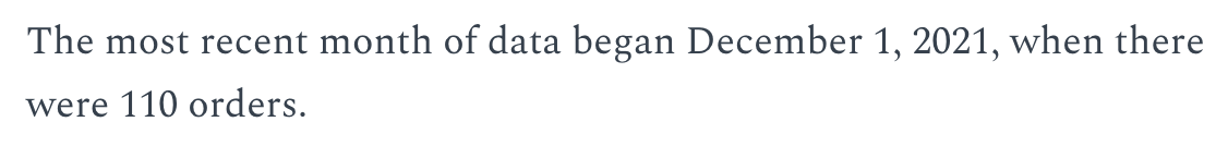
Adding a Placeholder
Override errors with the optional placeholder argument. This is useful for drafting reports before writing your queries.
<Value placeholder="sales last year"/>Sales in the last fiscal year were [sales last year]Placeholder: no data currently referenced., a change of [X%]Placeholder: no data currently referenced. vs. the prior year.
Formatting Values
Evidence supports a variety of formats - see value formatting and the fmt prop below for more info.
Aggregated Values
Values support basic aggregations such as, min, max, median, sum, avg
<Value data={orders} column="sales" agg="avg" fmt="usd0" />Customize Color Values
<Value data={orders} column="sales" agg="avg" fmt="usd0" color="#85BB65" />Red Negative Values
If the value is negative, the font color will automatically change to red, overriding any color specified by the color prop.
<Value data={NegativeSales} column="max_sales" agg="avg" fmt="usd0" redNegatives="true" />Options
Query name, wrapped in curly braces
- Options:
- query name
Column to pull values from
- Options:
- column name
- Default:
- First column
Row number to display. 0 is the first row.
- Options:
- number
- Default:
- 0
Text to display in place of an error
- Options:
- string
Format to use for the value (see available formats)
- Options:
- Excel-style format | built-in format | custom format
Sets behaviour for empty datasets. Can throw an error, a warning, or allow empty. When set to 'error', empty datasets will block builds in build:strict. Note this only applies to initial page load - empty datasets caused by input component changes (dropdowns, etc.) are allowed.
- Default:
- error
Text to display when an empty dataset is received - only applies when emptySet is 'warn' or 'pass', or when the empty dataset is a result of an input component change (dropdowns, etc.).
- Options:
- string
- Default:
- No records
Specifies the font color of the Value.
- Options:
- CSS name | hexademical | RGB | HSL